One Hundred & Fifty Fashion Ecommerce Homepages

150 Fashion Ecommerce Homepages


In this post you’ll find a selection of 150 Fashion Ecommerce Homepages listed in alphabetical order.

Each has been captured on a 1920×1080 screen, so you can see where they’re responsive, where they’re left-aligned, centred, etc. Some are higher end, some are lower. Some sell things other than clothes. Some are US, some UK, some from other countries. A couple have got chrome plugins visible (sorry!). But it’s interesting to take a look at each of them.

It’s interesting to see what’s common between most, and the elements that make some stand out. It’s also useful to think about them from an aesthetic point of view, from a brand point of view, a user journey point of view, and from a direct sales point of view.

Each store name links through to the site thanks to the great @erikau! Take a look & add a note in the comments with any thoughts you have on any of these.

1. 18 Waits
18 Waits
 
 
2. 7 for All Mankind
7 for All Mankind
 
 
3. A Kind of Guise
A Kind of Guise
 
 
4. Acne
Acne
 
 
5. Aether
Aether
 
 
6. Agent Provocateur
Agent Provocateur
 
 
7. Alex & Alexa
Alex & Alexa
 
 
8. Aloha From Deer
Aloha From Deer
 
 
9. Aloha Rag
Aloha Rag
 
 
10. Altrec
Altrec
 
 
11. American Apparel
American Apparel
 
 
12. American Eagle
American Eagle
 
 
13. Anthropologie
Anthropologie
 
 
14. APC
APC
 
 
15. Aubin & Wills (RIP)
Aubin & Wills (RIP)
 
 
16. Azita
Azita
 
 
17. Barbour
Barbour
 
 
18. Barbour
Barbour
 
 
19. Ben Silver
Ben Silver
 
 
20. Best Made
Best Made
 
 
21. Bird
Bird
 
 
22. BlackMilk
BlackMilk
 
 
23. Boden
Boden
 
 
24. Bona Drag
Bona Drag
 
 
25. Boux Avenue
Boux Avenue
 
 
26. Bridge & Burn
Bridge & Burn
 
 
27. Burberry
Burberry
 
 
28. CHCM
CHCM
 
 
29. Circle of Unity
Circle of Unity
 
 
30. Cocosa
Cocosa
 
 
31. Coggles
Coggles
 
 
32. Cos
Cos
 
 
33. Couverture & the Garbstore
Couverture & the Garbstore
 
 
34. Creatures of Comfort
Creatures of Comfort
 
 
35. Cutler & Gross
Cutler & Gross
 
 
36. Darkroom
Darkroom
 
 
37. Del Toro
Del Toro
 
 
38. Dezeen Watches
Dezeen Watches
 
 
39. DF
DF
 
 
40. Dora
Dora
 
 
41. Dottie Clover
Dottie Clover
 
 
42. Dover Street Market
Dover Street Market
 
 
43. Dqm
Dqm
 
 
44. Duluth Pack
Duluth Pack
 
 
45. Dune
Dune
 
 
46. End
End
 
 
47. Farfetch
Farfetch
 
 
48. Fenwick
Fenwick
 
 
49. Fine
Fine
 
 
50. Firmament
Firmament
 
 
51. Flatspot
Flatspot
 
 
52. Folk
Folk
 
 
53. Frances May
Frances May
 
 
54. Free People
Free People
 
 
55. Freshcotton
Freshcotton
 
 
56. Gargyle
Gargyle
 
 
57. Gilt
Gilt
 
 
58. Goodhood
Goodhood
 
 
59. Grandpa
Grandpa
 
 
60. Grenson
Grenson
 
 
61. Grey Area
Grey Area
 
 
62. Hanon Shop
Hanon Shop
 
 
63. Hard Graft
Hard Graft
 
 
64. HeyFair
HeyFair
 
 
65. Hickoree’s
Hickoree's
 
 
66. Hiut
Hiut
 
 
67. Howies
Howies
 
 
68. Huh Store
Huh Store
 
 
69. I Love Ugly
I Love Ugly
 
 
70. J Peterman
J Peterman
 
 
71. JF & Son
JF & Son
 
 
72. Journelle
Journelle
 
 
73. Kaufmann
Kaufmann
 
 
74. La Garconne
La Garconne
 
 
75. Lauren Moffatt
Lauren Moffatt
 
 
76. Lazy Oaf
Lazy Oaf
 
 
77. Leif
Leif
 
 
78. Liquor Store
Liquor Store
 
 
79. LL Bean
LL Bean
 
 
80. LN CC
LN CC
 
 
81. Looback
Looback
 
 
82. Maas
Maas
 
 
83. Madewell
Madewell
 
 
84. Mikkat Market
Mikkat Market
 
 
85. Millican
Millican
 
 
86. Monsoon
Monsoon
 
 
87. Mr Hare
Mr Hare
 
 
88. Mr Porter
Mr Porter
 
 
89. Mulberry
Mulberry
 
 
90. Nasty Gal
Nasty Gal
 
 
91. Neighbour
Neighbour
 
 
92. NikeID
NikeID
 
 
93. Nitty Gritty
Nitty Gritty
 
 
94. Norse Projects
Norse Projects
 
 
95. Norse Store
Norse Store
 
 
96. Oak
Oak
 
 
97. Oi Polloi
Oi Polloi
 
 
98. OnlyMag
OnlyMag
 
 
99. Opening Ceremony
Opening Ceremony
 
 
100. Orvis
Orvis
 
 
101. Ovadia & Sons
Ovadia & Sons
 
 
102. Paar
Paar
 
 
103. Park&Bond
Park&Bond
 
 
104. Pixie Market
Pixie Market
 
 
105. Poketo
Poketo
 
 
106. Present
Present
 
 
107. Pretty Sucks
Pretty Sucks
 
 
108. Pull&Bear
Pull&Bear
 
 
109. PYS
PYS
 
 
110. Rapha
Rapha
 
 
111. Reigning Champ
Reigning Champ
 
 
112. RH
RH
 
 
113. Saks Fifth Avenue
Saks Fifth Avenue
 
 
114. Saturdays NYC
Saturdays NYC
 
 
115. Schoolhouse
Schoolhouse
 
 
116. Sephora
Sephora
 
 
117. Shipley Halmos
Shipley Halmos
 
 
118. Sixpack
Sixpack
 
 
119. Slam City
Slam City
 
 
120. Spanish Moss
Spanish Moss
 
 
121. Spareblend
Spareblend
 
 
122. Ssense
Ssense
 
 
123. Stag
Stag
 
 
124. Starling
Starling
 
 
125. Steven Alan
Steven Alan
 
 
126. Stiff
Stiff
 
 
127. Superdenim
Superdenim
 
 
128. Supreme
Supreme
 
 
129. Sweaty Betty
Sweaty Betty
 
 
130. The Hip Store
The Hip Store
 
 
131. Tobi
Tobi
 
 
132. Toms
Toms
 
 
133. Totokaelo
Totokaelo
 
 
134. Traitor
Traitor
 
 
135. Tres Bien Shop
Tres Bien Shop
 
 
136. Umble & Co
Umble & Co
 
 
137. Union
Union
 
 
138. Unionmade
Unionmade
 
 
139. Uniqlo
Uniqlo
 
 
140. Urban Outfitters
Urban Outfitters
 
 
141. Vivienne Westwood
Vivienne Westwood
 
 
142. Wary Parker
Wary Parker
 
 
143. Wayward Daughter
Wayward Daughter
 
 
144. Wellgosh
Wellgosh
 
 
145. West Elm
West Elm
 
 
146. Whistles
Whistles
 
 
147. Woodlands
Woodlands
 
 
148. YMC
YMC
 
 
149. Youasme
Youasme
 
 
150. Zara
Zara


Site Speed Benchmarking

Google Analytics & Site Speed – Benchmark Report

I’m putting together a free ‘Google Analytics Site Speed’ benchmark report at the moment (an ebook basically), as I’ve specifically been asked about it by a few clients who are really interested in site speed, but have had trouble with the standard Google Analytics info.

I thought I’d open that up to other people here, either to be included in the benchmarking, or to receive the free report. The report will include:

  • How Google Analytics calculates site speed data, and how to improve data collection to improve it.
  • All of the caveats, how you can avoid them, and how to easily get more meaningful numbers from Google Analytics itself.
  • Actual benchmark data from a series of (anonymised) websites. (so that rather than asking “is 5 seconds average good?” you can see data for other sites)
  • How to compare your site against the benchmarks, and how to track site speed ongoing.
I have about 20 sites signed up so far to be included in the benchmarking. Most are in the 100k-1million visits per month range, with a couple smaller and a couple much larger. If you’d like one of your sites to be included in the benchmarking, please do fill in your info below.
Equally, if you’d just like a copy of the free report when it’s complete, fill in your info below.

[contact-form-7 id=”493″ title=”Contact form 1″]

 Thanks! And do feel free to pass this along to anyone else you think may find it useful.

Google’s 300 Million User Olympic Experiment

Google’s Enormous Olympic Experiment

Google have launched lots and lots of Olympic content within their main search results. They have also created a neat user interface to join all of this together and, in doing so, have essentially created a giant Olympics ‘website’ with tens of thousands of pages, all integrated directly among search results themselves.

Other search engines have included medal tables, and basic information around The Games. This goes a little further, removing much of the reason for searchers to visit the official London 2012 site and broadcaster sites. It also points to the future of Google’s “Knowledge Graph” project, and how this may affect other website owners.

This post covers the Olympic ‘website’, pulls out some specific examples from the UI (with notes), and then talks about the implications for the future. It’s split into 4 sections:

  1. The Background.
  2. Google’s Olympic “Website”.
  3. An explanation of the scale of this experiment.
  4. Some thoughts about future implications.


1. The Background

When Google first launched AdWords it was easy to spot the tweak itself (“they’re showing ads!”), but it was also very easy to miss the implications. Nobody would have said “that’s going to make Google the most important company in the world”. Similarly, when Google started talking about “The Knowledge Graph”, it was met with a similar shrug (“they’re showing facts??”). But the way they’ve used this to present Olympics data may have implications for every website owner.

Here’s a search for ‘London 2012’ at the moment:

The right-hand side over there is the ‘homepage’ in their Olympic website.

And here were 4 quick thoughts about that from Google+:
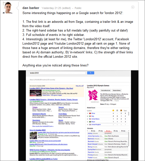
More interesting than that though: All of those links over on the right are clickable, taking you to subpages within a gigantic, constantly updated Olympic 犀利士
‘website’ that overlays itself around search results.

2. Google’s Olympic ‘Website’?

Google introduced “The Knowledge Graph” earlier this year. The explanation was that they were now going to show facts & figures in the right-hand column of search results. For example like the following:

Where that differs to what they’ve done around the Olympics is that their Olympic results have A) a set of user interface elements specifically for the event and B) a fully self-contained navigation structure C) appear globally (whereas ‘knowledge graph’ content is largely reserved for the States).

In other words, Google have created a complete ‘Olympic Website’ within the right-hand panel of search results. Rather than linking off to other sites, 50% of the page on any search closely related to the Olympics is now Google’s own content (or, rather, other content presented as Google’s).

To contextualise that ‘50% of the page’ bit further: The Olympics is the biggest event in the world, taking the biggest chunk of ‘event advertising’ budget from the world’s biggest brands, and Google have chosen to ditch their right-hand ads area (and in some cases the ‘top’ ads area) in favour of showing ‘their own’ content.

This happens on core olympic phrases (‘London 2012’, ‘Olympics’, ‘Medal Table’, etc), but also on much wider terms. Here’s an example of a ‘long-tail’ Olympic phrase, followed by a comparison of the ‘Google’ areas vs other areas:

Here’s the comparison of the ‘Google data’ there vs actual search data leading to other websites:

(Why visit the official site (in pink), when you can stay inside Google’s hedged garden? (in green)).

Here’s a breakdown of the different elements contained within this Olympic content:

Google’s Olympic ‘Site’ contents

This Google embedded olympic ‘website’ includes the following:

  1. Every participating country. (205 of them I think, including the independents)
  2. Every sport (eg. ‘swimming’; 36 of them in total according to the official site; 26 according to Wikipedia (!))
  3. Every ‘event’ (eg. ‘men’s 50m freestyle’. There are 34 of these within ‘swimming’ alone)
  4. Every medal. (personalised to pull out local medals based on your location)
  5. Every competitor position throughout both heats & finals, in every event. (the UK alone has 541 athletes, including team sports)
  6. Details of world records. (from wikipedia)
  7. Links to the appropriate place on the official website. (no doubt negotiated to allow them to do all of this)
  8. Links to watch online (personalised depending on the country you view from)

Here are some examples of how this appears.

Examples: Core Olympic Terms

Here’s what shows when you search ‘Olympics’:

The Medal Table

And here’s what shows when you search ‘Medal Table’:

You’ll note that appears in the central search pane, not on the right-hand side.

Country Terms

There’s a country page for every single country. You can reach these by searching for “London 2012 [Country Name]”, or other related phrases like “[Country Name] Olympic Team”, or in some cases things like “TeamGB”. You can also reach these by clicking any of the links within the Google ‘site’ itself.

Here’s the example for the USA team:

Clicking any of the links there takes you to another page within the ‘site’. Eg. the ‘Swimming’ link takes you to a hub page…

Sports

Every sport has its own ‘hub’ page, with links to all of the individual events within the sport. Here’s the ‘Gymnastics’ hub page:

So, for example, a Google search for ‘swimming’ no longer shows the ads it used to, it instead shows content similar to the above.

In most cases, the right-hand results appear fully expanded. In a few cases they appear like this:

And below these Sports pages are individual event pages, for example:


3. Just How Big is Google’s Experiment?

So Google have essentially created an entire, real-time Olympics website overlaid on top of search results. All of the content is readily available on the official site, and on a number of broadcaster sites. That’s quite a big experiment.

The Olympics is by far the biggest global event of the year; and by doing this they are foregoing lots of ad revenue. By doing this they are also training lots of users how to use the right-hand sidebar in this context. It’s worth taking a look at how many users might experience it. Here are some back of the envelope calculations:

There are 3 main entry points to all of this:

  1. Click on any Google Doodle  over the period of the Olympics. They all lead to a different ‘sport’ page.
  2. Search for any of the sports-related terms.
  3. Search for anything Olympics related.


1. How Much Doodle Traffic Sees This?

At the moment, every Google Doodle points to one of these Olympic pages. Here’s the ‘Fencing’ example:


To estimate how much traffic a Doodle generates, let’s look at an example: Amelia Erhart’s birthday was a week or so ago and she was featured on a Google Doodle. This is the graph of her Wikipedia traffic over the last month:
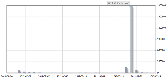
That’s 1.776621 million views in a single day. Her Wikipedia page is the 2nd result for her name so, if we take an optimistic view of how many people would click it (25%), that means her doodle generated roughly 7 million searches for her name in a single day. Across the 2 weeks of the Olympics, we can therefore roughly estimate the doodles will cause close to 100 million searches.

2. How much ‘Sports’ Traffic Sees Google’s Olympics Content?

The next traffic entry point is ‘sports’ related searches, many of which show these Olympic pages as results.

Monthly ‘phrase’  match for “Basketball” gets 20.4m monthly searches. So if we’re pessimistic there and estimate only 25% of those show the Google olympic page, that’s still 2.5 million searches over the 2 weeks for that sport alone (one of 36). Let’s assume that basketball is representative, that gives us 90 million searches across the 36 sports.

3. How much pure ‘Olympic’ Traffic Sees the Content?

Finally, we have people searching specifically for Olympics related traffic.

Here’s the brilliant Alex Balfour (do follow him on Twitter if you are not already), head of new media for London 2012, explaining just how much interest there is in the Olympics:

So, if we pessimistically assume another 100 million ‘Olympics’ specific related searches over the 2 weeks, we’re close to 300 million searches displaying Google’s olympic-specific results. And that excludes the Paralympics.

Experiment Size Summary

Summary: We can assume Google are training users across roughly 300 million searches how to use these types of results. We can also assume they’re foregoing much of the ad revenue across these 300 million searches.

Even if those numbers were out by a factor of 10, that’s still enormous. And as we’ve been pessimistic in all our numbers, it could just as easily be ‘300 million users’ rather than ‘300 million searches’.

4. Future Ramifications

It may be that this is all just a bit of fun. But rolling out these big new UI changes for The Olympics is quite a big bet. It may well be that there is strategy behind this.

Here’s an example of how 4 recent strands of Google activity could tie together nicely alongside this. The 4 strands are:

  1. The Knowledge Graph.
  2. The Walled Garden.
  3. Attribute-Based Searching & price comparison.
  4. Paid Inclusion.

If we add that all together, this type of UI may be a useful model for Google to replicate entire websites worth of content alongside search results, and to expand its ad revenue further in future.

1. The Knowledge Graph

Google officially announced The Knowledge Graph, and have been pushing this in the states. At the moment this is purely informational, and usually appears on terms with no ‘buying intent’ (ie. terms where you wouldn’t normally see ads).
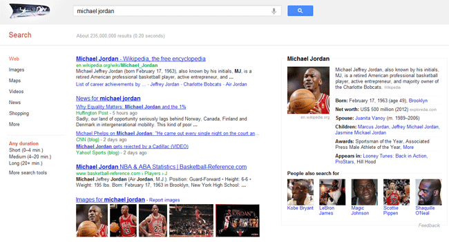
The Olympics is the first time the UI elements from this have been used alongside search results in anything other than a ‘Wikipedia-lite’ type way. Google show here that – rather than simply individual collections of data points – they’re happy to recreate full, cohesive ‘websites’ of content if it suits their needs.

2. The Walled Garden

Facebook is very much a walled garden, trying to create its own fully self-contained web within the web. Facebook tries very hard to suck visitors in as often as it can, but does all that it can and incentivises advertisers to avoid giving them options to leave the garden. Twitter appears to be going down the same route, closing off APIs, bringing display of photos and videos within their own interface.

Google have also made several moves toward this over the last few years. To mention just 3:

  • Pushing Microformats and author information, which allow Google to understand content and give them the context needed to redisplay it themselves in any format they choose.
  • The almighty ‘Not Provided’ debacle, whereby Google now hold back masses and masses of important data from website owners, all of which used to be seen as ‘quid pro quo’ for allowing Google to use our content.
  • Google+ itself, which encourages both brands and users to create more content on Google’s own properties, rather than to try and suck visitors away from Google.

Moving visitors away from Google and on to their intended destination used to be Google’s core purpose. Now they would prefer that users’ ‘intended destination’ is Google itself.

This fits in very nicely with that. All of the information in Google’s Olympic ‘site’ is already out there on other websites, but they would now prefer you to find the information without leaving Google itself. These UI elements again give them a great way of doing that with all types of content, and to tie that together into a cohesive, navigable architecture.

3. Attribute Based Product Search

The entirety of the Knowledge Graph, and Google’s Olympics ‘site’ are based around a UI and data that lend themselves perfectly to attribute-based product search.

Google recently bought 2 different ‘attribute-based’ price comparison engines: ‘Beat That Quote’, a UK-based price comparison site and ‘SparkBuy’, a Seattle-based laptop comparison site.

Also along these lines, Google’s ‘Credit Card Comparison’ UI and entry point have been tweaked recently in the UK:
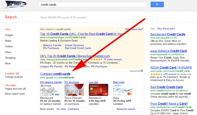
Google have also launched a few other attribute-based search tools themselves, with fairly neat UIs, including:

Just as the Olympic site lets you browse and narrow down between ‘Countries’, ‘Sports’ and ‘Medals’, it is not much of a stretch to see that this could just as easily be ‘Brands’, ‘Categories’ and ‘Products’. If you take a look at the ‘flights’ & ‘cars’ comparison sites above, you’ll see elements from each could fit nicely into the Olympic model.

4. Paid Inclusion

One final piece in this is the change of Google Shopping from a ‘free’ service to a paid model. The official story here was that this was to improve the quality of data by discouraging advertisers who submitted anything and everything with very little accuracy.

But fitting this with the type of UI used in the Olympic ‘site’, it does 2 things from Google’s point of view:

  1. Allows them to gather far more ‘attribute-based’, relational data from product advertisers, and incentivises them to ensure its accuracy.
  2. Introduces the ‘paid inclusion’ model, which means advertisers no longer bid based on keywords specifically, but based purely on their willingness to pay if a product is clicked.

Once this is fully working, it allows Google to choose how and where products are displayed, whereas previously those have been the choice of the advertiser. Again, that fits in perfectly with the UI elements here to allow Google to show ads that users have ‘navigated to’ rather than ‘searched for’.

As just one example of how this may benefit them: Whereas a search for ‘Amazon’ reaps Google just a few pennies if the user clicks on the Amazon brand PPC ad. If they were able to bring all of Amazon’s products into their own UI, and train users to browse through those on Google itself, they would reap far more than a few pennies each time the user jumped off to a product page.

Adding this all Together

Adding all of this together, and the new UI areas Google is testing would work equally well for both pure content, and for paid inclusion ads.
  • From a pure content point of view, the new UI elements work very nicely for recreating complete ‘content’ websites alongside search results.
  • From a product point of view, just as the Olympic site lets you browse and narrow down between ‘USA’ to ‘Tennis’, to ‘Medal Tables’, this could just as easily be ‘Samsung’, ‘Phones’ and ‘Galaxy S3’. It would not be such a stretch to extend this to recreate the full ‘product discovery’ phase of ecommerce sites.

And of course, by launching the UI elements for this tagged to such a huge event, they are able to gather data extremely quickly on its use, and to educate a huge mass of users in how to use these elements.

What do you think?

What do you think of Google’s Olympic content? Is this just a nice user interface piece Google have put together to help us all? Does it point at other changes? And what  would you do if Google did this to your niche?

ps. big thanks to the many people speaking about this on Twitter, including @danbellj, @StokedSEO @wilreynolds, @dannysullivan.

Increase the Chance Readers Will Share Your Content

How to Improve the Chance Readers Will Click Your ‘Like’, ‘Tweet’ & ‘Share’ Buttons

This blog post offers 5 simple steps to improve the likelihood that readers will tweet, share, like, or ‘plussify’ (is there a word for google+?) your content.

As ever, this will not work if your content has no natural value (or no perceived value) in the first place. This article assumes that you are putting some genuine effort into content.

There is an image accompanying each step: Look closely to spot the simple tweaks.

The Example

Below is an image taken from the foot of an article from The Guardian.

Looking just at the area at the bottom of the image, you’ll recognise a really common way of displaying ‘share links’. This is basically the ‘checkbox’ implementation that you would apply if someone asked you “could you add some share links to our articles?”

Below, we’ll make a few tweaks to this to increase the likelihood of shares.


Step 1: Remove the Ringfence

In the image above, you’ll notice that the ‘share’ buttons have been grouped together & ringfenced into a little block in the page. This looks neat aesthetically, and the reason that it looks neat aesthetically is that they are essentially rinfenced into a  block that is easy for your brain to understand “that’s the share button area”.

By ringfencing it like that, and easily identifying it as the ‘share button area’, that automatically tells people who habitually use these links “your sharing stuff is here. click us!” But, of course, it has the negative side effect of saying to everybody else (who does not habitually click sharing buttons) “feel free to ignore us – this entire block is just the sharing stuff you always ignore!”.

Here’s the same area with that ringfencing removed, and the share buttons placed directly into the ‘content’ area:

Not such a big difference, but the equivalent of placing them as ‘the next logical thing to look at’, rather than a dead end stop.


Step 2: Add ‘Social Proof’

‘Social Proof’ is a bit of a cliche, but – speaking incredibly generally – if you show someone that others have taken an action before, they are more likely to take it themselves.

There are many ways to do that, the most simple being to automatically include the number of tweets/likes/shares.


Step 3: Remove the ‘Choice Paralysis’ or ‘Choice Blindness’.

Again speaking very generally, if you offer someone a choice of 5 things, it is far harder for them to decide than  if you offer just 1 or 2.

If it is more important to your business to get ‘tweets’ than it is to get ‘shares’, prompt for the ones you want.

Above we’ve included just 1. It’s often better to make big changes first & then taper down, than to go the other way round.
 

Step 4: Add a Prompt

Many people are not in the ‘habit’ of sharing content directly from web pages. It is not always appropriate, but a simple, friendly prompt can sometimes help to temporarily break that ‘not sharing’ habit on your page:


Step 5: Give it a Go.

Test this and see what actually works for you.

Everything here is a rule of thumb that has worked on some sites and for some audiences, but may not work on others. If you like, it would be very easy to A/B test each of them (for example, it may work better for some audiences if you dramatically highlight your ‘social sharing’ block, rather than simply place it in the content area).

If A/B testing is too much effort, simply take the less scientific approach & try things out for a limited period of time to see if you can judge any change.


That’s it

Please do leave feedback in the comments below. And of course, please do share this article if you think others would find it useful!

Joey Barton’s Self Promoted Tweets

Is Joey Barton Paying for Twitter Followers?

Joey Barton is a premiership footballer & is a well-known/controversial celebrity (if you’re reading this, you’ve probably heard of him).

During the last day of the premiership his name trended on Twitter for a while in the UK after he ‘seemed to’ attempt to headbutt & kick a couple of opposing players.

But this is a note about his twitter use, rather than his life as a footballer.

Here’s a screengrab of his timeline:

The odd thing you may notice there is the orange ‘Promoted Tweet’ icon underneath the top tweet. Here’s a close-up:

You’ll see there the line reads ‘Promoted by Joseph Barton’ – ie. Joey Barton seems to have ‘promoted’ the tweet himself.

‘Promoted Tweets’ are very common among advertisers, but are pretty much unheard of for individuals. Here’s what it means to promote a tweet:

In other words: Twitter says Joey Barton is promoting his tweets. Twitter says that promoted tweets are paid for. Therefore it looks like Joey Barton is paying to promote his tweets in order to reach a wider audience.

Strange, & quite clever. What do you think?

The Amazon Percentage Trick

The Amazon Percentage Trick

Can you spot the numeric trick Amazon is using in the image below? It tricked Techdirt  into saying “books increased between about 4,000% and 6,500%. Yes, that’s multi-thousands of percent increases”.

Amazon have gained masses of PR & links as a result of this simple little trick over the years, and authors (like Paulo Coelho) have benefited from its misleading nature. Gizmodo, The Metro, Huffington Post, The Guardian, The Mirror, and many others all fell for this same trick around the time of the London Riots, reporting a 5,000% rise in Baseball Bat sales.

The trick is that the % numbers are nothing to do with an increase in actual sales. They’re actually a somewhat meaningless number used to describe the increase in ‘Amazon Sales Rank’.

The maths is:

((Old Sales Rank / New Sales Rank) * 100) – 100

So, for example, if we look at number 3 on the list up there, “The Devil & Miss Prym” was in position 9,760 in Amazon’s sales rank (ie there were 9759 books selling more copies). Now it’s at position 202 (there are just 201 books selling more copies). The formula is:

((9760 / 202) * 100) – 100 = 4,731

Amazon report that using an up arrow and ‘4,731%’ and we naturally jump to the conclusion that means the book’s unit sales have increased 4,731%. In reality, we still have no idea of the actual change in unit sales.

As a simple example: If we follow the idea of ‘the long tail’, a book at position ‘220’ in Amazon’s charts may not sell a whole lot more than a book at position ‘9760’. It may simply be that the book sold 30 copies last week (in position 9,760) and sold 60 copies this week (in position 220). That would simply mean a 100% increase in sales, rather than 4,731%.

In fact – though unlikely in this case – it’s possible for products to increase in ‘sales rank’ even when they sell less units.

Amazon use lots of clever pricing, ranking & user interface tricks like this – it’s worth keeping an eye out for others.

12 Large Companies Who Don’t Own Their Main Domain

12 Companies Who Forgot to Buy Their Dotcom Domains

I’ve helped a few companies buy ‘their’ domain names from other owners over the last few years. Usually it’s either ‘very easy and expensive’, ‘hard but cheaper’, or just ‘totally impossible’.

Here’s a very quick post showing some dotcoms who likely fit into the ‘impossible’ category, plus a few where companies likely just haven’t tried hard enough. Big, big companies who – very surprisingly – don’t own their own dotcom domains. (Number 10 is probably most surprising).

If you know of any other interesting ones, do drop them in the comments.

1. Nissan.com

Here’s a very surprising one – one of the world’s largest car manufacturers – yet they don’t own their dotcom domain. It’s an interesting case, and if you look at the site the ‘lawsuit’ link is worth a read. Here’s Nissan.com:

2. Paul Smith

Google claims there are over 300,000 exact match searches for ‘paul smith’ each month, and the brand has a very mature ecommerce site. Yet here’s paulsmith.com:

3. Compass Group

Ever heard of Compass Group? They’re a FTSE 100 food company, brought in revenue of £15.8 billion in 2011, and employ almost half a million staff. Yet they don’t own ‘compass.com’ or ‘compassgroup.com’ – here’s what sits there instead:

4. ABBA

A bit of a cheat this one, as I’m not sure ABBA even have a website, but here’s the current homepage at abba.com:

5. Tate

Tate Online has over 65,000 works of art, they have 4 immensely famous art galleries (the oldest stretching back to 1897). Here’s Tate.com:

6. Fairy

Proctor and Gamble brought in $82 billion of revenue in 2011. One of their most famous UK brands – fairy – has to settle for ‘fairynonbio.co.uk’. Here’s the current Fairy.com:

7. London

The city of London threatened to set up a ‘.london’ generic top level domain, yet the city doesn’t even own its own dotcom. The ‘official’ website is at visitlondon.com, meanwhile the main dotcom houses this:

8. Guardian

Guardian.co.uk gets over 4 million daily visitors. I’d bet guardian.com gets quite a lot of accidental typo traffic. Here’s its current incarnation:

9. Greggs

With 1,500 shops, 400,000 ‘likes’ on Facebook and almost 20,000 employees, Greggs Bakers is both a large company and quite committed to the web. As a result, it’s quite surprising that this currently sits at Greggs.com:

10. Argos

Argos passed the ‘£1 billion online’ barrier way back in 2008, yet years later they still haven’t managed to claim the Argos.com domain. Amazing, eh?

11. Distilled

While not as large as some of the others here (at least not yet!), Distilled will be known to lots of domainers and search marketers. Despite specialising in search & online reputation, even they haven’t managed to get hold of distilled.com. (Big thanks to the brilliant @carlhendy for this & the next one). Here’s the current distilled.com site:

12. Skoda

Another from the car industry is Skoda – one of the biggest brand rejuvenations in recent history after their purchase by Volkswagen, yet here is the content of Skoda.com:

Any more?

Do drop a note in the comments if you know of any other really interesting/surprising ones.

The Impact of Small Changes

The Impact of Small Improvements

In situations where there is a chain of events, very small improvements within the chain can yield犀利士
big end results. Most digital marketing/website user journeys are like this.

As a silly example, the chart below shows how a brand could increase their ’email revenue’ from £391,500 to £500,772, simply by improving performance at each step of a user journey by 1 percentage point.

In the example, an ecommerce brand is sending a single email to a list of 1.5 million addresses. The average order value in each scenario is £145.

Take a look at scenario A and compare the ‘actual’ results at each stage to scenario B:

This is a simple, very crude example, but a nice reminder of a pattern that appears in almost every single user journey.

Google Now Hiding UK Search Data

Google Now Hiding UK & Other International Keyword Data

Last year, Google made a change that meant lots of keyword data was suddenly stolen away from website owners. Thankfully for UK & other international sites, they only rolled this out on Google.com.

‘(Not Provided)’ – The International Rollout

The bad news is, they’ve now rolled out this change to several other international Google sites, meaning you will now lose far more search query data.

Whereas in the past you would see all of the actual search terms bringing traffic from Google, now you get a large lump of data categorised under the anonymous phrase ‘(not provided)’.

Here’s a graph from a UK site showing the increase in the amount of data Google have hidden today vs the same period last week.:

How to View This for Your Own Sites

To view the above graph for your own sites, do the following:

  1. Add this ‘advanced segment’ to Google Analytics: http://bit.ly/hiddendata
  2. Go to the ‘audience overview’ report (‘Audience’ in the left-hand navigation, then ‘Overview’).
  3. In the graph, set the time format to ‘hourly’. (above the right-hand side of the graph)
  4. At the top-right of the screen, set the date range to today; then tick ‘compare to past’, and choose the same day last week as your comparison.
  5. Finally, select the Advanced Segment you set up in step 1 by clicking ‘Advanced Segments’ toward the top left of the screen, and choosing ‘Not Provided – Organic Search’ in the right-hand ‘Custom Segments’ box.


More Background

Here’s a post from Econsultancy talking about the impact of the original rollout. There is also a blog post over there containing a ‘hack’ to work around this to a very small extent.

If you’ve managed to gather any data on this so far for your site, do leave a note on the comment. And do share this via Twitter if you think it would help others.

Top 100 UK Journalists on Twitter

Top 100 UK Journalists on Twitter – by Social Influence

 
Andy Barr & the team over at 10 Yetis released the 2nd version of their “top 100 journalists on Twitter犀利士
“ list.

Their very useful top 100 uses a complex ranking algorithm, summed up by this line:

“Obviously, the nicer journos are to PRs, the higher up they are likely to appear.”

In order to add some pseudo-pseudo-science to the list, I put together this version using PeerIndex, which attempts to rank the top 100 using data around their twitter ‘Authority’, ‘Activity’ & ‘Audience’.

Take a look! Follow them! Share it on Twitter if it’s useful, and be sure to check out 10 Yetis’ original post

The Top 100, Pseudo-Scientifically Ranked: