Here’s another small tweak to the Google Analytics user interface.
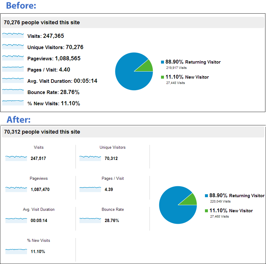
The charts in ‘Overview’ reports used to be pinned to the left, even if you were using a very, very wide screen. Now, they concertina out depending on the width of your screen. (not shown in the screengrab below, they also now label these with any segments you have applied)