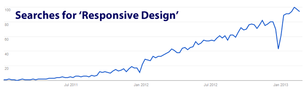
Here’s a graph showing interest in the phrase ‘Responsive Design’ over the last couple of years:
Responsive design is (as you probably know) where you design a website/pages in such a way that the content displays differently on different devices. Usually that means navigation/content is organised differently on phone vs desktop/laptop (and sometimes differently on tablets, and at other screen sizes).
One of the largest problems for this tactic over the last 6 months has been that – whereas screen resolution (the number of pixels displayed) on smartphones used to be roughly the same across all phones – this now varies wildly. For example:
- Old iPhone screens were 320 pixels wide by 480 pixels high (320×480).
- The Samsung Galaxy S3 has a screen resolution of 720×1280 pixels.
In other words, only taking into account those 2 phones, if you’re designing a ‘mobile site’, you’re actually designing for 2 very, very different displays: One that displays 153,600 pixels, and one that displays 921,600 pixels (ie. 6 times as many pixels).
As a result, there are many sites that were designed when 320×480 resolution phones were the norm, which now look very odd when viewed on newer phones.
The New Problem: Laptop screen resolutions are about to become radically different
The new problem is very similar to the phone pixel problem, but across laptops. For the last few years, the majority of laptop sales have been among laptops with roughly similar screen resolutions., give or take 10-20%.
Over the next 6 months however, laptop manufacturers are focussing on much, much higher screen resolutions. Here’s one example to illustrate this:
- A current 11″ Macbook Air has a resolution of 1366×768 pixels. (ie roughly the same as a Galaxy S3)
- The Google Chromebook Pixel has a resolution of 2560×1700 pixels. (ie. roughly twice as wide as the macbook air screens, and a massive eight times the width of an old iPhone)
Here are 2 mockups showing what a website will look like on a Macbook Air, and how it will look on the Google Chromebook Pixel.
Keep in mind the 2 devices have roughly similar physical dimensions. In other words, the screen you are looking at will be the same size, but the content displayed on it will look radically different:
What You’ll See on a Google Chromebook Pixel:
What You See on a Macbook Air:
 In other words, both laptops are (very roughly speaking) a similar size, but the content displayed on them will look utterly, radically different in scale.
The Compound Problem
If you add this new problem to the existing ‘phone resolution’ problem, it means that to simply design your site to look ok on ‘all phones’ and ‘all laptops’, you have to consider a massive range of resolutions, including:
- Old iPhone: 320×480 pixels.
- Samsung Galaxy S3: 720×1280 pixels.
- Current 11″ Macbook Air: 1366×768 pixels.
- Google Chromebook Pixel: 2560×1700 pixels.
Add in tablets to this, and more forthcoming Apple Retina products, and it becomes very messy firstly to design across all of this, and perhaps more importantly to optimise for conversions/user experience.
Is this not exactly the problem rwd intends to solve? The hardware is now just offering us extremes in similarly sized physical spaces but the resolution difference has been present from the first 320px phones vs the original large screen imacs from a few years ago. We’re only just starting to figure it out though, so the best design patterns have yet to be established. Exciting times IMO 🙂
The Google Chromebook Pixel looks like the odd one out to me here and and I can’t see much point to such a high resolution screen on that size display.
Screen size fragmentation has always been an issue, but it does seem to be getting worse rather than better.
It will be fine. The answer will be more media queries around resolution, pixel size, orientation etc. It will be difficult for a couple of years, then it will be a done deal, and the new problem will be haptic interfaces / human eye focus detection. The big thing for me is that having a website that is “behind the curve” in terms of design and tech is changing from having something that “looks old-fashioned” to having something that just doesn’t work.