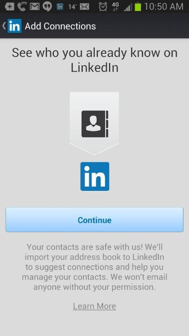
Occasionally at the moment when you click a LinkedIn notification on your phone, the LinkedIn app opens and – before you’re taken to the notification – you’re presented with this screen:
That looks fairly mundane at first glance. Often apps present you with information before taking you to wherever you were going. But… if you click ‘Continue’ there, you’re actually saying “I agree to LinkedIn importing my phone address book, and storing all of those personally identifiable details within their database”.
I think that’s a bit sneaky for 3 reasons:
At first glance it’s not obvious that clicking ‘continue’ will do something as big as import your address book (!)
This appears when you click on a notification from your phone (eg. someone new connecting to you). In that context, ‘Continue’ feels like it means ‘Continue on to where we were taking you’; not ‘Continue importing the details of all of my friends/family/colleagues’.
There is no ‘skip this’ option at all. Your 2 choices are ‘Continue’ (presented in high-contrast) or ‘Learn More’ (presented in grey-on-grey text).
I think: it feels like this has been done with the intent of getting people to click ‘Continue’ without realising what they’re doing, or because it appears to be their only real choice.
The Daily Mail are testing an update to their Comment UX.
It’s easy to ignore comments, and their usefulness, but take a look at a few of the Daily Mail’s articles, count up the number of comments & the number or ratings on those comments, make an estimate as to what percentage of people bother to rate comments, and it very quickly dawns on you that they make hundreds of thousands of pounds for the Daily Mail every year.
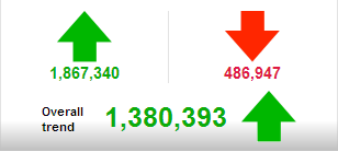
Here’s an example 24 hour snapshot of their comment ratings:
ie. They regularly get 2.5 million comment ratings in a day. Another way of looking at that: they’re close to a billion comment ratings per year. Therefore, whereas a change to comments style on most sites would be a trivial tweak, for the Daily Mail it can have a big effect.
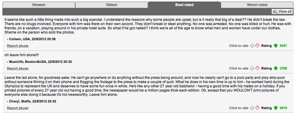
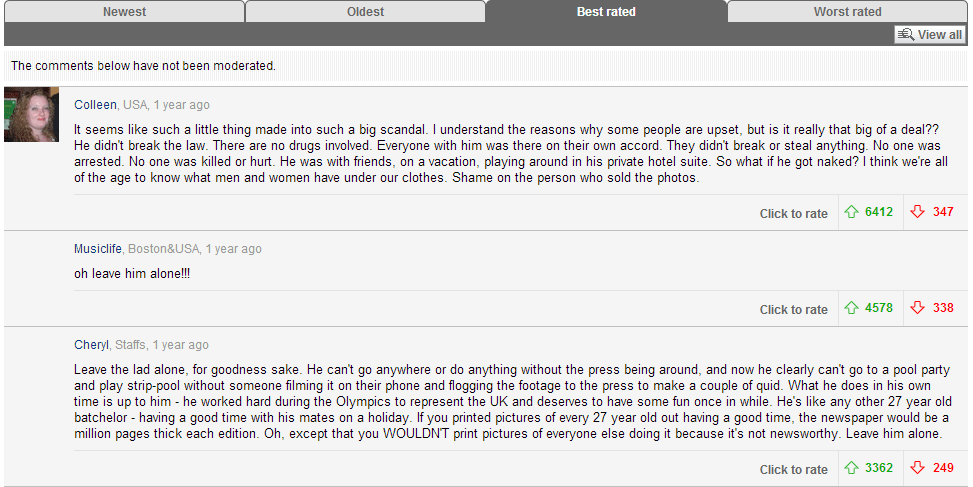
Old vs New
Here’s the same set of comments in their old style & their new style (click for larger images if you like):
Old Style:
New Style:
The main differences here are:
Inclusion of headshots where available.
They now split out ‘positive’ & ‘negative’ comments, rather than just showing the aggregate.
The text is much larger.
Username leads now, and is clickable through to user’s profile.
Times are relative to the current time, rather than being timestamps.
The more prominent profile info, and the headshot are quite telling. I wonder if at some point they will do a bit more with profile pages themselves? There’s a big opportunity for newspaper sites to get ‘user generated’ news commentary right.
Extra Social Prompts:
Move the mouse over the comments & you get two new extras.
Top right is a small down arrow that allows you to report abusive comments.
Below the comment a block of prominent ‘share’ icons appear.
The Daily Mail have an interesting issue in that their articles are hugely commented on, but surprisingly ‘undershared’. This may help address that a little.
The’ve also tacked a little call to action to visit their ‘stats’ page onto the end of comments:
If you’ve never visited their stats page before, it’s very much worth a look: http://dailymail.co.uk/stats. If you were a sensible competitor, you’d have been following their stats for the last few months and would be able to see whether this UX update has increased/decreased the likelihood of users leaving and rating comments.
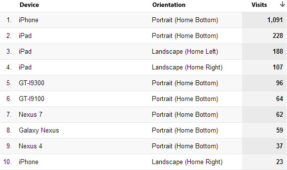
Which way do people hold their phones/tablets when browsing websites? Here’re the results of a little experiment in ‘Mobile Device Orientation’. There are only abou犀利士 t 1,500 visits here, but interesting nonetheless:
This shows info ‘on load’ of pages, but it is broadly similar on this site when factoring in people who rotate the device after the page loaded.
I’m about to roll this out for a couple of large sites, but thought I would share the stats before I do so. If you’d like any more info drop me a note!
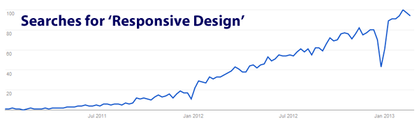
Here’s a graph showing interest in the phrase ‘Responsive Design’ over the last couple of years:
(the big dip toward the end is christmas – everyone forgot about responsive design for christmas it seems)
Responsive design is (as you probably know) where you design a website/pages in such a way that the content displays differently on different devices. Usually that means navigation/content is organised differently on phone vs desktop/laptop (and sometimes differently on tablets, and at other screen sizes).
One of the largest problems for this tactic over the last 6 months has been that – whereas screen resolution (the number of pixels displayed) on smartphones used to be roughly the same across all phones – this now varies wildly. For example:
Old iPhone screens were 320 pixels wide by 480 pixels high (320×480).
The Samsung Galaxy S3 has a screen resolution of 720×1280 pixels.
In other words, only taking into account those 2 phones, if you’re designing a ‘mobile site’, you’re actually designing for 2 very, very different displays: One that displays 153,600 pixels, and one that displays 921,600 pixels (ie. 6 times as many pixels).
As a result, there are many sites that were designed when 320×480 resolution phones were the norm, which now look very odd when viewed on newer phones.
The New Problem: Laptop screen resolutions are about to become radically different
The new problem is very similar to the phone pixel problem, but across laptops. For the last few years, the majority of laptop sales have been among laptops with roughly similar screen resolutions., give or take 10-20%.
Over the next 6 months however, laptop manufacturers are focussing on much, much higher screen resolutions. Here’s one example to illustrate this:
A current 11″ Macbook Air has a resolution of 1366×768 pixels. (ie roughly the same as a Galaxy S3)
The Google Chromebook Pixel has a resolution of 2560×1700 pixels. (ie. roughly twice as wide as the macbook air screens, and a massive eight times the width of an old iPhone)
Here are 2 mockups showing what a website will look like on a Macbook Air, and how it will look on the Google Chromebook Pixel.
Keep in mind the 2 devices have roughly similar physical dimensions. In other words, the screen you are looking at will be the same size, but the content displayed on it will look radically different:
What You’ll See on a Google Chromebook Pixel:
What You See on a Macbook Air:
In other words, both laptops are (very roughly speaking) a similar size, but the content displayed on them will look utterly, radically different in scale.
The Compound Problem
If you add this new problem to the existing ‘phone resolution’ problem, it means that to simply design your site to look ok on ‘all phones’ and ‘all laptops’, you have to consider a massive range of resolutions, including:
Old iPhone: 320×480 pixels.
Samsung Galaxy S3: 720×1280 pixels.
Current 11″ Macbook Air: 1366×768 pixels.
Google Chromebook Pixel: 2560×1700 pixels.
Add in tablets to this, and more forthcoming Apple Retina products, and it becomes very messy firstly to design across all of this, and perhaps more importantly to optimise for conversions/user experience.
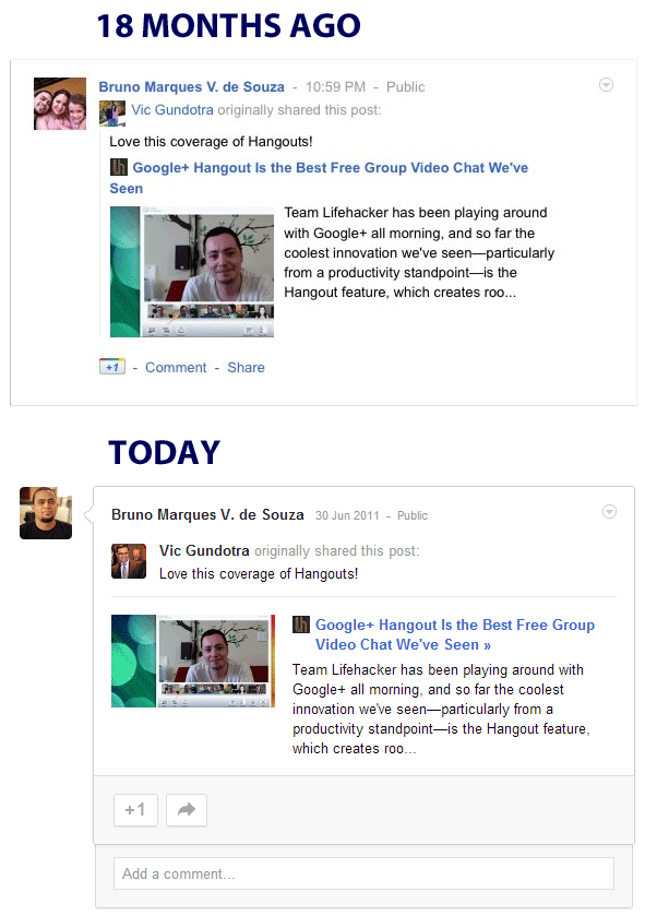
They’ve just changed (quite significantly) the way the ‘+1’ & ‘share’ buttons on Google+ posts look. I thought it would be worth going back and looking at how things looked when it first launched vs how it looks now.
Below are 2 screengrabs of exactly the same Google+ post, 18 months apart. The first image shows how it looked at the time it was posted. The second image shows how it looks after 18 months of subtle, incremental UI tweaks.
Interesting to compare the 2, pick out the differences, and think about why they’ve made the changes.