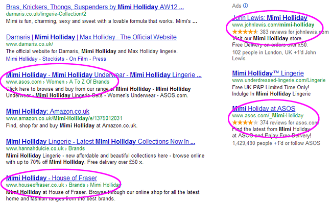
Here is a complete A-Z of the top Google Suggestions covering all questions people ask.
In other words a list of the top Google Suggestions for:
- ‘Why…’
- ‘Who…’
- ‘Where…’
- ‘When…’
- ‘What…’
- ‘How…’
- along with each of those with every letter of the alphabet added. (ie. ‘why a…’, ‘why b…’, etc).
| WHY? | WHO? | WHERE? | ||
| why is the sky blue | who unfollowed me | where is chuck norris | ||
| why do we yawn | who is | where’s wally | ||
| why do cats purr | who calls me | wherever you will go lyrics | ||
| why am i always tired | who left x factor | wherever you will go | ||
| why am i so tired | who wants to be a millionaire | where is the love lyrics | ||
| why do we dream | who invented the internet | where is merlin filmed | ||
| why is the sea salty | who sampled | where the wild things are | ||
| why do we celebrate halloween | who was the first james bond | where is downton abbey | ||
| why are manhole covers round | who you are lyrics | where eagles dare | ||
| why buy new | who clothing | where am i | ||
| Why A… | Who A… | Where A… | ||
| why am i always tired | who ate all the pies | where am i | ||
| why am i so tired | who am i | where are they now | ||
| why are manhole covers round | who are the kardashians | where are your kidneys | ||
| why are flamingos pink | who am i lyrics | where are mumford and sons from | ||
| why am i not losing weight | who and whom | where am i game | ||
| why am i always hungry | who am i quiz | where are your appendix | ||
| why am i so ugly | who are the illuminati | where are mk1 from | ||
| why are people gay | who are the avengers | where are you now | ||
| why are we here | who are you | where are the northern lights | ||
| why am i always cold | who are ee | where are the cotswolds | ||
| Why B… | Who B… | Where B… | ||
| why buy new | who built the pyramids | where brooklyn at | ||
| why be happy when you could be normal | who built stonehenge | where brooklyn at lyrics | ||
| why band | who breastfeeding | where best to see northern lights | ||
| why buy an ipad | who built the moon | where be that blackbird to | ||
| why become a teacher | who built the eiffel tower | where by | ||
| why buy a tablet | who built the ark song | where bananas grow | ||
| why boats | who built the titanic | where buy oyster card | ||
| why blog | who built the pyramids in egypt | where best to invest money | ||
| why bird | who built the taj mahal | where bats live | ||
| why become an accountant | who built buckingham palace | where bora bora | ||
| Why C… | Who C… | Where C… | ||
| why can’t i get pregnant | who calls me | where can i buy amazon gift cards | ||
| why can’t i lose weight | who clothing | where can i download movies for free | ||
| why can’t we be friends | who created the internet | where can i download free music | ||
| why can’t i get a job | who can claim income support | where can i watch the valleys online | ||
| why can’t i sleep | who celebrates diwali | where can i sell my books | ||
| why can’t i stop eating | who cares scotland | where can i download free albums | ||
| why cats purr | who called | where can i buy viagra | ||
| why can’t i get a boyfriend | who cares trust | where can i use paypal | ||
| why can graphite conduct electricity | who created google | where can i buy an ipad mini | ||
| why commercial law | who created facebook | where can i buy an oyster card | ||
| Why D… | Who D… | Where D… | ||
| why do we yawn | who do you think you are | where do penguins live | ||
| why do cats purr | who dies in emmerdale | where do bananas come from | ||
| why do we dream | who discovered america | where does harry styles live | ||
| why do we celebrate halloween | who discovered electricity | where did the titanic sink | ||
| why do men cheat | who died today | where does snot come from | ||
| why do dogs eat grass | who dares wins | where does chocolate come from | ||
| why do we cry | who do i look like | where does nigel slater live | ||
| why do people smoke | who died in hollyoaks | where did aids come from | ||
| why did hitler hate jews | who definition of health | where does helium come from | ||
| why do dogs lick | who discovered dna | where does gary barlow live | ||
| Why E… | Who E… | Where E… | ||
| why evolution is true | who else is involved with jimmy savile | where eagles dare | ||
| Why emulsifiers are added to some foods | who else jimmy savile | where ever you will go | ||
| why eat | who else writes like | where ever you will go lyrics | ||
| why exercise | who europe | where everybody knows your name | ||
| why electric ballroom | who enforces health and safety law | where exists | ||
| why eye man | who enforces the hsw | where eagles dare theme | ||
| why eat 5 a day | who else is accused with jimmy saville | where ever you go | ||
| why exercise is good for you | who employment | where everybody knows your name lyrics | ||
| why exercise is important | who else was with jimmy saville | where eagles dare lyrics | ||
| why evolution is wrong | who else but quagmire | where eagles dare music | ||
| Why F… | Who F… | Where F… | ||
| why fashion | who framed roger rabbit | wherefore art thou | ||
| why facebook is bad | who flies where | where food comes from | ||
| why finance | who framed roger rabbit 2 | where from where now | ||
| why fashion is important | who framed roger rabbit characters | where fred | ||
| why fashion republic | who found america | where flavour is king | ||
| why favourite a tweet | who follows me | where food comes from ks1 | ||
| why football is better than rugby | who follows who | where french is spoken | ||
| why fill tyres with nitrogen | who fought in world war 2 | wherefore | ||
| why financial services | who founded apple | where foxes live | ||
| why facebook | who fought in world war 1 | where famous people live | ||
| Why G… | Who G… | Where G… | ||
| why go to university | who gon stop me lyrics | where good ideas come from | ||
| why get married | who growth charts | where going on a bear hunt | ||
| why georgia lyrics | who got voted off strictly | where gives student discount | ||
| why get an ipad | who goes there | where game of thrones filmed | ||
| why goldman sachs | who guards the guards | where go the boats | ||
| why god Why lyrics | who gon stop me | where god left his shoes | ||
| why grant thornton | who gets child benefit | where got ghost | ||
| why georgia tab | who gets working tax credit | where google lives | ||
| why gif | who gave freddie mercury aids | where giraffes live | ||
| why get a tablet | who games | where gold is found | ||
| Why H… | Who H… | Where H… | ||
| why has cj left eggheads | who has played james bond | where have you been | ||
| why house of fraser | who has the most twitter followers | where have you been lyrics | ||
| why has orange changed to ee | who has died today | where have all the flowers gone | ||
| why have i missed my period | who has the highest iq | where have all the cowboys gone | ||
| why hsbc | who has won the most oscars | where have you been all my life | ||
| why have i lost my voice | who has unfollowed me on twitter | where have all the flowers gone lyrics | ||
| why has janine left eastenders | who has played dr who | where has our arsenal gone | ||
| why heskey is better than messi | who hosts | where has dan lobb gone | ||
| why have kids | who has taylor swift dated | where has youtube app gone | ||
| why hitler hated jews | who health definition | where has cj gone from eggheads | ||
| Why I… | Who I… | Where I… | ||
| why is the sky blue | who is | where is chuck norris | ||
| why is the sea salty | who invented the internet | where is the love lyrics | ||
| why is my period late | who invented electricity | where is merlin filmed | ||
| why is my internet so slow | who internet | where is downton abbey | ||
| why is my hair falling out | who is the stig | where is rita ora from | ||
| why is loft insulation needed | who is my mp | where is hot in december | ||
| why is my computer so slow | who is calling me | where is hot in october | ||
| why is the sea blue | who is demi lovato | where is hot in november | ||
| why is communication important | who invented the light bulb | where is bora bora | ||
| why is yawning contagious | who is banksy | where is hot in january | ||
| Why J… | Who J… | Where J… | ||
| why jailbreak iphone | who jobs | where jesus was born | ||
| why jailbreak apple tv | who just called me | where james arthur from | ||
| why jailbreak ipad | who just left x factor | where jesus died | ||
| why jewellers | who job vacancies | where jesus walked | ||
| why jp morgan | who just unfollowed me | where james bond born | ||
| why join deloitte | who just died | where justin bieber lives | ||
| why join the army | who jobs uk | where jurassic park was filmed | ||
| why jailbreak ipad 2 | who joined the eu in 2004 | where john lennon was shot | ||
| why jailbreak ipad 3 | who joined the league of nations | where jews worship | ||
| why jailbreak ps3 | who just died in hollyoaks | where julius caesar died | ||
| Why K… | Who K… | Where K… | ||
| why kpmg | who killed jfk | where kids play | ||
| why kakashi killed rin | who killed cock robin | where kids play kettering | ||
| why kodak failed | who knew lyrics | where keith lemon from | ||
| why kun aguero | who knows where the time goes | where kosovo is located | ||
| why kpmg over big 4 | who killed tupac | where kidney pain | ||
| Why kardashians are famous | who killed derek branning | where kangaroos live | ||
| why keep fit | who killed john lennon | where koalas live | ||
| why kosher salt | who killed martin luther king | where keynes went wrong | ||
| why knead bread | who killed jesus | where kilimanjaro | ||
| why keep a journal | who killed bambi | where killer whales live | ||
| Why L… | Who L… | Where L… | ||
| why loft insulation is needed | who left x factor | where london | ||
| why learn a language | who left x factor tonight | where love lives | ||
| why lucy left x factor | who let the dogs out | where london magazine | ||
| why love matters | who left strictly | where learners grow | ||
| why lyrics | who left strictly come dancing | where like sql | ||
| why law | who let the dogs out lyrics | where like | ||
| why learn french | who left strictly tonight | where love lives lyrics | ||
| Why legislation relating to employment exists | who left i’m a celebrity | where lucy spraggan | ||
| why learn spanish | who left i’m a celebrity last night | where late the sweet birds sang | ||
| why learn latin | who lived in my house | where lesotho and what is its capital | ||
| Why M… | Who M… | Where M… | ||
| why men cheat | who moved my cheese | where my water | ||
| why men pull away | who made the bayeux tapestry | where me keys where me phone | ||
| why medicine | who made god | where my wellies take me | ||
| why me | who made the internet | where my perry | ||
| why mumps etc | who manages one direction | where memories meet | ||
| why morgan stanley | who made google | where my keys | ||
| why men fall in love | who made your pants | where my droid | ||
| why marketing | who made facebook | where my iphone | ||
| why must i cry | who moved my cheese pdf | where magazine | ||
| why must i be a teenager in love | who made the first car | where me keys where me phone lyrics | ||
| Why n… | Who N… | Where N… | ||
| why not edinburgh | who needs a crb check | where nobody knows lyrics | ||
| why not associates | who names hurricanes | where not exists | ||
| why nations fail | who number is this | where next | ||
| why not | who narrates come dine with me | where next association | ||
| why not zoidberg | who narrates thomas the tank engine | where next islington | ||
| why not both | who needs public liability insurance | where names come from | ||
| why not to vote for romney | who named the planets | where not to live in london | ||
| why not me lyrics | who needs a tv licence | where not exists sql | ||
| why not models | who narrates classic car rescue | where not to go in new york | ||
| why not hairdressing | who needs a flu jab | where not in sql | ||
| Why O… | Who O… | Where O… | ||
| why obama will win | who or whom | where or were | ||
| why orwell matters | who owns domain | where on earth is carmen sandiego | ||
| why obama won | who owns the bank of england | where or when | ||
| why onions make you cry | who owns google | where or when lyrics | ||
| why organic | who owns harrods | where our food comes from | ||
| why outsource | who owns tesco | where on earth | ||
| why obama sucks | who owns mcdonalds | where our food comes from ks1 | ||
| why oxford | who owns red bull | where offers student discount | ||
| why oh why | who owns amazon | where on the body is the liver | ||
| why oliver wyman | who owns aston martin | where oh where oh where is shadow | ||
| Why P… | Who P… | Where P… | ||
| why poverty | who phoned me | where perry | ||
| why poverty bbc | who played james bond | where penguins live | ||
| why pwc | who plays voldemort | where polar bears live | ||
| why people wear poppies | who plays mrs brown | where plastic comes from | ||
| why people communicate | who plays dumbledore | where pail limbs lie | ||
| why people smoke | who pain ladder | where phrases come from | ||
| why pharmacy | who painted the mona lisa | where peaceful waters flow | ||
| why people cheat | who plays thor | where people live | ||
| why partition a hard drive | who played darth vader | where pizza originated | ||
| why people take drugs | who put the colours in the rainbow | where planes go to die | ||
| Why Q… | Who Q… | Where Q… | ||
| why quit | who qualifies for legal aid | where questions | ||
| why questions | who qualifies for working tax credit | where queen victoria born | ||
| why quotes | who qualifies for income support | where quasimodo lived | ||
| why qwerty | who qualifies for free school meals | where queen victoria lived | ||
| Why qualitative research | who qualifies for child benefit | where quality is cheaper | ||
| why quaggas became extinct | who qualifies for dla | where queen lives | ||
| why quality is important | who qualifies for heating allowance | where qualitative research is used | ||
| Why questionnaires are good in research | who qualifies for free prescriptions | where qatar | ||
| Why quantitative research | who qualifies for flu jab | where quotes | ||
| why quit caffeine | who qualifies for council tax benefit | where queen elizabeth 1 lived | ||
| Why R… | Who R… | Where R… | ||
| why root android | who rang me | where rainbows end | ||
| why recycle | who runs the world | where rita ora from | ||
| why root nexus 7 | who rules the world | where ravens dare | ||
| why republic | who remembers me | where rainbows end film | ||
| why read | who represents | where r your kidneys | ||
| why recycling is important | who run the world lyrics | where rainbows end movie | ||
| why reading is important | who really killed jfk | where rainbows end book | ||
| why religion is bad | who reads the guardian | where rivers flow into | ||
| Why recruitment | who really runs the world | where refined people live | ||
| why research | who retweeted me | where r u | ||
| Why S… | Who S… | Where S… | ||
| why stop now | who sampled | where should i live | ||
| why should we employ you | who shot jr | where shall i go on holiday | ||
| why so serious | who scored | where’s wally | ||
| why should we recycle | who says lyrics | where spirits have lease | ||
| why study history | who shot jfk | where sql | ||
| why study law | who sings gangnam style | where should eggs be stored | ||
| why study economics | who shot john lennon | where should i invest my money | ||
| why study psychology | who sings titanium | where silence has lease | ||
| why study languages | who supplies my electricity | where sayings come from | ||
| why should i worry lyrics | who supplies my water | where should i go on holiday quiz | ||
| Why T… | Who T… | Where T… | ||
| why the whales came | who to follow on twitter | where the wild things are | ||
| why this kolaveri | who to follow on instagram | where the trail ends | ||
| why the world will end in 2012 | who to notify when you move | where the truth lies | ||
| why teach | who to call in a power cut | where to live in london | ||
| why thank you | who to address cover letter to | where to stay in paris | ||
| why take folic acid | who to marry in skyrim | where the heart is | ||
| why the sky is blue | who takes paypal | where them girls at lyrics | ||
| why turkey at christmas | who the hell cares | where the hell is matt | ||
| why twilight sucks | who tb | where to eat in london | ||
| why the west rules for now | who takes american express | where to go in november | ||
| Why U… | Who U… | Where U… | ||
| why upgrade to windows 8 | who unfollowed me | where us the love lyrics | ||
| why ubs | who unfollowed me on tumblr | where u at lyrics | ||
| why use a lens hood | who unfriended me on facebook | where upon | ||
| why use twitter | who unfollowed me on instagram | where us malta | ||
| why use social media | who used to live in my house | where u at | ||
| why use paypal | who used to present x factor | where uk exports go | ||
| why u no | who uk | where us the love | ||
| why use linux | who uses makaton | where u been | ||
| why upgrade to ios 6 | who u are lyrics | where u from brudda | ||
| why use linkedin | who unfollowed me free | where u going | ||
| Why V… | Who V… | Where V… | ||
| why volunteer | who vs whom | where vs were | ||
| why vote for romney | who votes for christopher maloney | where volcanoes are found | ||
| why vote for obama | who viewed my profile | where vs having | ||
| why volcanoes erupt | who vacancies | where vanilla comes from | ||
| why vegan | who voted off x factor | where volcanoes occur | ||
| why visit london | who voices spongebob | where viruses are found | ||
| why vote | who viewed my twitter | where vitamin d is found | ||
| why volunteer abroad | who voices stewie griffin | where vs having sql | ||
| why vegetarian | who voted off strictly | where vampires come from | ||
| why visit new york | who voices the argos aliens | where vampires live | ||
| Why W… | Who W… | Where W… | ||
| why was the berlin wall built | who wants to be a millionaire | where was skyfall filmed | ||
| why will the world end in 2012 | who went out of x factor | where was crickley hall filmed | ||
| why women cheat | who was the first james bond | where was harry potter filmed | ||
| why wont my iphone sync | who won x factor 2010 | where was war horse filmed | ||
| why was jesus crucified | who won x factor 2011 | where was downton abbey filmed | ||
| why was the great wall of china built | who wrote the bible | where was mama mia filmed | ||
| why was franz ferdinand assassinated |
who was jack the ripper | where was i | ||
| why was anne boleyn executed | who wants to be a millionaire game | where was rita ora born | ||
| why we fight | who won the voice | where was hot fuzz filmed | ||
| why wont my ipod sync | who was voted off x factor | where were | ||
| Why X… | Who X… | Where X… | ||
| why xbox is better than ps3 | who x factor | where x factor filmed | ||
| why xmas | who xdr tb | where x factor judges houses 2012 | ||
| why x factor is bad | who x factor 2010 | where x | ||
| why x86 | who xpert | where xbox made | ||
| why xbox sucks | who x factor judges 2012 | where x in sql | ||
| why xbox is better than pc | who x factor 2012 | where x factor started | ||
| why xml | who x whom | where x factor | ||
| why x86 for 32 bit |
who x factor judges | where can i download movies for free | ||
| why xhtml | who xing | where can i download free music | ||
| why xylem is described as a tissue | who xpert mtb rif | where can i watch the valleys online | ||
| Why Y… | Who Y… | Where Y… | ||
| why you heff to be mad | who you are lyrics | where you gonna sleep tonight | ||
| why you no | who you are chords | where you lead | ||
| why you shouldn’t smoke | who you are | where you at lyrics | ||
| why you little | who you are jessie j chords | where you gonna run to | ||
| why you want to work for us | who you finna try | where your treasure is | ||
| why yawn | who you are guitar chords | where you lead lyrics | ||
| why you are applying for an apprenticeship | who you gonna call | where you are lyrics | ||
| why you mad | who you are tab | where you will go lyrics | ||
| why you’re not married | who you’re around lyrics meek | where you lead rock choir | ||
| why you should stop smoking | who you callin pinhead | where you at | ||
| Why Z… | Who Z… | Where Z… | ||
| why zebras don’t get ulcers | who zambia | where zayn malik from | ||
| why zoos are bad | who zimbabwe | where zebras live | ||
| why zoos are good | who zoomin who | where zayn malik from originally | ||
| why zip files | who zippy | where zeus lives | ||
| why zoos should be banned | whozoo | where zeno taught | ||
| why zoos should not be banned | who zoonotic diseases | where zinc is found | ||
| why zurich | who zanzibar | where zayn malik was born | ||
| why zumba | who z scores | where zeus was born | ||
| why zoos are bad facts | who zinc | where zayn malik lives | ||
| why zara is successful | who zeus father | where zippo made | ||
| WHEN? | WHAT? | HOW? | ||
| when is easter 2013 | what car | how i met your mother | ||
| when do clocks change | what hi fi | how to make pancakes | ||
| when is halloween | what is my ip | how to write a cv | ||
| when the lights went out | what is gangnam style | how did i do | ||
| when is children in need 2012 | what time is it | how to lose weight | ||
| when do the clocks go back | what does yolo mean | how to save a life lyrics | ||
| when will the world end | what is love | how to write a cover letter | ||
| when is eid 2012 | what happened to lucy spraggan | how to tie a tie | ||
| when is diwali 2012 | what is my ip address | how we do lyrics | ||
| when is the world going to end | what the font | how to draw | ||
| When A… | What A… | How A… | ||
| when a stranger calls | what are cookies | how are you in spanish | ||
| when are you most fertile | what are prime numbers | how are you in french | ||
| when a man loves a woman | what are capers | how are you in german | ||
| when am i ovulating | what are piles | how are hurricanes named | ||
| when am i most fertile | what a wonderful world | how are volcanoes formed | ||
| when a man loves a woman lyrics | what are hd brows | how are hurricanes formed | ||
| when am i due | what are stem cells | how are you in italian | ||
| when a child is born | what app | how are fossils formed | ||
| when a child is born lyrics | what are the 7 wonders of the world | how are sedimentary rocks formed | ||
| when are women most fertile | what a wonderful world lyrics | how are metamorphic rocks formed | ||
| When B… | What B… | How B… | ||
| when boris met dave | what body shape am i | how britain worked | ||
| when boys | what bike | how big is an acre | ||
| when baby due | what benefits am i entitled to | how big is the universe | ||
| when babies crawl | what benefits can i get | how big is the sun | ||
| when babies smile | what becomes of the broken hearted | how big is the moon | ||
| when britain ruled the skies | what browser am i using | how big is a2 | ||
| when baby sit up | what benefits can i claim | how big is a1 | ||
| when babies start teething | what book should i read | how big is a football pitch | ||
| when boris met dave watch online | what bra size am i | how bad do you want it | ||
| when baby sleep through night | what brings on labour | how bizarre | ||
| When C… | What C… | How C… | ||
| when can i retire | what car | how clean is your house | ||
| when can babies see | what camera | how can i lose weight | ||
| when can i take a pregnancy test | what colours make brown | how can i make money fast | ||
| when can i do a pregnancy test | what causes cramp | how can she slap | ||
| when can i upgrade my phone | what causes mouth ulcers | how clubbing changed the world | ||
| when can babies drink tap water | what causes thrush | how can i keep from singing | ||
| when can i get pregnant | what county is london in | how chocolate is made | ||
| when can you get pregnant | what causes high blood pressure | how children learn | ||
| when can babies drink water | what car should i buy | how cold is space | ||
| when can babies have cows milk | what causes hiccups | how can you catch hiv | ||
| When D… | What D… | How D… | ||
| when do clocks change | what does yolo mean | how did i do | ||
| when do the clocks go back | what do dreams mean | how did bruce lee die | ||
| when do you ovulate | what does 3 mean | how does twitter work | ||
| when does morning sickness start | what does my name mean | how did hitler die | ||
| when do babies smile | what does reem mean | how did bob marley die | ||
| when do babies start teething | what do contractions feel like | how do you get thrush | ||
| when does i’m a celebrity start | what digital camera | how does icloud work | ||
| when do babies crawl | what do you call jokes | how do you work out percentages | ||
| when do babies start talking | what does jls stand for | how do you delete facebook | ||
| when does winter start | what does gangnam mean | how do you make pancakes | ||
| When E… | What E… | How E… | ||
| when easter 2013 | what eats spiders | how effective is the pill | ||
| when eight bells toll | what element are you | how effective is the morning after pill | ||
| whenever | what eats a fox | how effective are condoms | ||
| when eid 2012 | what ethnicity is rita ora | how effective is the implant | ||
| when evil calls | whatever happened to baby jane | how enzymes work | ||
| when everything’s made to be broken | whatever | how earthquakes happen | ||
| when eagles dare | what eats frogs | how electricity works | ||
| when everything changes change everything | what eats slugs | how email works | ||
| when england won the world cup | what elle wears | how effective is the coil | ||
| when elephants weep | what everyone wants | how electricity is made | ||
| When F… | What F… | How F… | ||
| when feel baby move | what film should i watch | how far did i run | ||
| when father papered the parlour | what font | how fast is my internet | ||
| when friendship kills | what foods contain iron | how far pregnant am i | ||
| when fifa 13 out |
what font is this | how fast does the earth spin | ||
| when father papered the parlour lyrics | what football is on tonight | how fast is 4g | ||
| when facebook started | what foods are high in protein | how fast does hair grow | ||
| when flanders failed | what foods contain protein | how far is a click | ||
| when frederic was a little lad | what foods contain vitamin b12 | how fast is the speed of light | ||
| when fertile | what foods are carbohydrates | how far is a light year | ||
| when father was away on business | what face shape do i have | how fast can you type | ||
| When G… | What G… | How G… | ||
| when god was a rabbit | what goes around comes around | how great thou art | ||
| when goldilocks went to the house of the bears | what graphics card do i have | how great thou art lyrics | ||
| when gotham is ashes | what generation is my ipod | how great is our god lyrics | ||
| when good men do nothing | what goes around comes around lyrics | how green was my valley | ||
| when geeks wed | what gets wetter as it dries | how great is our god | ||
| when god made you lyrics | what generation is my ipod touch | how great is our god chords | ||
| when god made you | what gas mark is 180 degrees | how great thou art chords | ||
| when genius failed | what game should i play | how good is our school | ||
| when giants walked the earth | what gets rid of garlic breath | how glass is made | ||
| when gta 5 out | what goes with salmon | how gps works | ||
| When H… | What H… | How H… | ||
| when harry met sally | what hi fi | how hot is the sun | ||
| when hitler stole pink rabbit | what happened to lucy spraggan | how high | ||
| when harry tries to marry | what happens in vegas | how high 2 | ||
| when harry met sally quotes | what happened on this day | how hot is lava | ||
| when halloween 2012 | what happens when you die | how high do planes fly | ||
| when harry met sally soundtrack | what happened to april jones | how hipster are you | ||
| when harry met sally trailer | what happens after death | how high is mount everest | ||
| when he plays piano in the dark | what happened to riley in hollyoaks | how heavy should i be | ||
| when harry met sally putlocker | what hurts the most lyrics | how he loves us lyrics | ||
| when he’s not a stranger | what happened to dex in home and away | how hurricanes form | ||
| When I… | What I… | How I… | ||
| when is easter 2013 | what is my ip | how i met your mother | ||
| when is halloween | what is gangnam style | how it should have ended | ||
| when is children in need 2012 | what is love | how it works | ||
| when is eid 2012 | what is the time | how it’s made | ||
| when is diwali 2012 | what is my ip address | how is babby formed | ||
| when is the world going to end | what is the minimum wage | how is crude oil formed | ||
| when is thanksgiving | what is a prime number | how is coal formed | ||
| when is my mot due | what is a verb | how is electricity made | ||
| when is half term | what is 4g | how is oil formed | ||
| when is the next full moon | what is instagram | how is the world going to end | ||
| When J… | What J… | How J… | ||
| when johnny comes marching home | what job is right for me | how j say | ||
| when jimmy met louis | what job should i do | how jet engines work | ||
| when jesus is my portion | what job is right for me uk | how joyful bear | ||
| when jessie came across the sea | what job would suit me | how jailbreak iphone 4 | ||
| when johnny comes marching home lyrics | what jobs can you get at 13 | how jaws should have ended | ||
| when jesus was born | what jobs can you get at 15 | how jennifer hudson lost weight | ||
| when james met robbie | what job can i do | how julius caesar died | ||
| when jelly bean galaxy s2 | what job is right for me quiz uk | how jump start car | ||
| when jesus is my portion lyrics | what job would i be good at | how john lennon died | ||
| when joining a motorway you should | what jobs can you get at 14 | how jews pray | ||
| When K… | What K… | How K… | ||
| when keeping it real goes wrong | what katie did | how kindle works | ||
| when kalin twins | what kate wore | how kidneys work | ||
| when karl met warwick | what katie ate | how kapow | ||
| when kids kill | what killed the dinosaurs | how kers works | ||
| when knights were bold | what kind of person am i | how kelly osbourne lost weight | ||
| when kindle paperwhite in uk | what katie does | how kids can make money | ||
| when kiran met karen | what katie did next | how kinect works | ||
| when kids get life | what kindle should i buy | how kevlar is made | ||
| when kiwis fly | what kind of learner am i | how kites fly | ||
| when kids start talking | what katie wore | how kinky are you quiz | ||
| When L… | What L… | How L… | ||
| when louis met jimmy | what laptop | how long is skyfall | ||
| when love takes over | what lies beneath | how long does it take to get to the moon | ||
| when life gives you lemons | what laptop should i buy | how long till christmas | ||
| when love takes over lyrics | what language is this | how long do cats live | ||
| when louis met | what language is spoken in belgium | how long does a cold last | ||
| when louis met jimmy savile | what language is gangnam style | how long to roast a chicken | ||
| when love walked in | what laptop to buy | how long to boil an egg | ||
| when love and hate collide | what language did jesus speak | how long to cook a chicken | ||
| when louis met the hamiltons | what language is spoken in brazil | how long does flu last | ||
| when love takes over chords | what lies below | how long do rabbits live | ||
| When M… | What M… | How M… | ||
| when my little girl is smiling | what makes you beautiful | how much is my car worth | ||
| when my little girl is smiling lyrics | what makes you beautiful lyrics | how many calories in a banana | ||
| when most fertile | what makes a good leader | how many days until christmas | ||
| when mac met cheese | what mountain bike | how much is my house worth | ||
| when money dies | what makes you beautiful chords | how many calories in an egg | ||
| when mot due | what movie should i watch | how many left | ||
| when morning sickness starts | what mobile | how much is a first class stamp | ||
| when my baby due | what motivates you | how many days until | ||
| when my baby | what mortgage can i get | how much is child benefit | ||
| when my mot due | what makes a good teacher | how many calories in an apple | ||
| When N… | What N… | How N… | ||
| when night is falling | what not antiques | how not to live your life | ||
| when nature calls | what not to eat when pregnant | how now brown cow | ||
| when nietzsche wept | what now lyrics rihanna | how nuclear power works | ||
| when new imac | what names mean | how not to worry | ||
| when nexus 4 back in stock |
what nationality is rita ora | how not to be boring | ||
| when not to have flu jab | what not to wear | how not to be jealous | ||
| when neil armstrong dies | what noise does a giraffe make | how not to cry | ||
| when needs must | what network is ee | how not to get pregnant | ||
| when next full moon | what number is this | how networks communicate | ||
| when new ipad | what noise does a zebra make | how not to write a novel | ||
| When O… | What O… | How O… | ||
| when objects work | what on tv | how old am i | ||
| when ovulate | what on tv tonight | how old is jerry hall | ||
| when one door closes | what olivia did | how old are union j | ||
| when off peak train times | what on in london | how old are ant and dec | ||
| when oil runs out | what oil for my car | how old is the earth | ||
| when our time comes | what oil do i need | how old is conor maynard | ||
| when overtaking at night you should | what organs can be transplanted | how old is daniel craig | ||
| when october goes | what on earth | how often should you poop | ||
| when ovulate after miscarriage | what organs can be donated | how old is tulisa | ||
| when o2 4g | what or which | how old is nigella lawson | ||
| When P… | What P… | How P… | ||
| when peace like a river | what pc | how pregnant am i | ||
| when penguins attack | what phone should i get | how popular is my name | ||
| when pigs fly level 12 | what pad | how paper is made | ||
| when paddy met sally | what pokemon are you | how paypal works | ||
| when parents text | what phone | how plastic is made | ||
| when pigs have wings | what price glory | how planning | ||
| when penguins attack 3 | what printer | how powerful is the wii u | ||
| when pigs fly level 18 | what percentage is tax | how plants grow | ||
| when push comes to shove | what pumpkin | how painful is labour | ||
| when penguins attack 4 | what phones have 4g | how paracetamol works | ||
| When Q… | What Q… | How Q… | ||
| when queen victoria was born | what qualifications do i need to be a nurse | how quickly does hair grow | ||
| when queen victoria died | what questions to ask a girl | how quickly do antibiotics work | ||
| when queen victoria became queen | what qualifications do i need to be an architect | how quickly can i get a passport | ||
| when questions | what questions to ask siri | how quickly can you fall in love | ||
| when quoting in an essay | what qualifications do i need to be a lawyer | how qr codes work | ||
| when queen victoria born | what qualifications are needed to be a doctor | how quick is 4g | ||
| when questioned caution | what questions do i ask at an interview | how quick is my internet | ||
| when queen victoria was born and died | what qualifications do i need to be a pilot | how quickly can you lose a stone | ||
| when queen elizabeth died | what questions are asked in a telephone interview | how quickly do mice breed | ||
| when qualifications fail | what questions to ask on a first date | how quick is my broadband | ||
| When R… | What R… | How R… | ||
| when robbie met james | what richard did | how rich is the queen | ||
| when r u most fertile | what rhymes with | how rich is bill gates | ||
| when rabbit howls | what records | how rich am i | ||
| when ronan met burt | what rating is skyfall | how rich is simon cowell | ||
| when romeo met juliet | what really happened | how real is made in chelsea | ||
| when relationships fail | what rhymes with orange | how rich is jk rowling | ||
| when ramadan 2013 | what rhymes with life | how rich is richard branson | ||
| when ryanair flights released | what rhymes with world | how rude modern manners defined | ||
| when rain clouds gather | what religion was hitler | how rich is justin bieber | ||
| when relationships go wrong | what rhymes with me | how reliable is the pill | ||
| When S… | What S… | How S… | ||
| when saturday comes | what star sign am i | how stuff works | ||
| when she was mine lyrics | what should i weigh | how secure is my password | ||
| when she loved me lyrics | what size is a3 | how soon is now | ||
| when september ends lyrics | what should we call me | how soon is now lyrics | ||
| when should i take a pregnancy test | what should i do with my life | how science works | ||
| when september ends | what shop | how stean gorge | ||
| when santa fell to earth | what stove | how sweet it is to be loved by you | ||
| when skies are grey | what should my blood pressure be | how solar panels work | ||
| when someone dies | what should i have for dinner | how safe is flying | ||
| when she was mine | what songs are on just dance 4 | how sweet it is | ||
| When T… | What T… | How T… | ||
| when the lights went out | what time is it | how to make pancakes | ||
| when to use a semi colon | what the font | how to write a cv | ||
| when to prune roses | what to do in london | how to lose weight | ||
| when the wind blows | what time is it in the uk | how to save a life lyrics | ||
| when the lights go out | what time is x factor on | how to write a cover letter | ||
| when to use an apostrophe | what to expect when you’re expecting film | how to tie a tie | ||
| when to use a colon | what to expect when you’re expecting | how to draw | ||
| when to take a pregnancy test | what tv | how to work out percentages | ||
| when to use | what to write in a wedding card | how to make scrambled eggs | ||
| when to use whom | what to take to uni | how to make cupcakes | ||
| When U… | What U… | How U… | ||
| when u see it | what uni | how ultrasound works | ||
| when u wish upon a star | what up | how unlock iphone 4 | ||
| when u say nothing at all | what users do | how ucas points work | ||
| when u want it | what used car | how uk deals | ||
| when uk time change | what university is right for me | how unfollowed me | ||
| when use semi colon | what uni course is right for me | how ugly am i | ||
| when us election | what uni course should i do | how universities use ukcat | ||
| when u believe lyrics | what uses the most electricity | how update iphone | ||
| when u say nothing at all lyrics | what uni course is right for me quiz | how us government works | ||
| when u believe | what up gangsta lyrics | how use siri | ||
| When V… | What V… | How V… | ||
| when vikings attack | what van | how vaccines work | ||
| when vikings attack release date | what version of flash do i have | how volcanoes are formed | ||
| when vampire diaries season 4 | what version of java do i have | how very dare you | ||
| when vikings attack ps3 | what version of ie am i using | how viagra works | ||
| when vodafone 4g | what vitamins are good for skin | how volcanoes erupt | ||
| when vikings attack review | what veg can rabbits eat | how vat works | ||
| when victims fight back | what vitamins are good for hair | how volcanoes work | ||
| when vikings attack trophies | what varieties of yeast are used in brewing | how viber works | ||
| when victims become killers | what video card do i have | how viruses work | ||
| when vikings attack trophy guide | what vitamins do what | how venice was built | ||
| When W… | What W… | How W… | ||
| when will the world end | what women want | how we do lyrics | ||
| when was my house built | what weight should i be | how we do | ||
| when was the internet invented | what would you do lyrics | how will the world end | ||
| when will it snow | what week number is it | how we do rita ora lyrics | ||
| when will i die | what was the holocaust | how will i die | ||
| when was jesus born | what was the great depression | how will i know lyrics | ||
| when was america discovered | what was the blitz | how were the pyramids built | ||
| when was electricity invented | what week of the year is it | how was venice built | ||
| when was facebook created | what was the first james bond film | how was the grand canyon formed | ||
| when will i ovulate | what was the industrial revolution | how we do chords | ||
| When X… | What X… | How X… | ||
| when xbox 720 | what xbox do i have | how xrays work | ||
| when x factor final 2012 | what xbox games are 3d | how x rays are produced | ||
| when xbox minecraft update | what xbox should i buy | how xbox live works | ||
| when xmas tree up | what x means | how x ray machines work | ||
| when x factor on | what xbox drive do i have | how xbox kinect works | ||
| when x factor on tonight | what x factor was olly murs in | how x-rays work for kids | ||
| when x factor final date | what xbox 360 do i have | how x factor works | ||
| when x factor kardashians | what xo means | how xbmc works | ||
| when xmas comes to town lyrics | what x factor live | how xbox 360 works | ||
| when xbox dashboard update | what xoxo means | how x-ray crystallography works | ||
| When Y… | What Y… | How Y… | ||
| when you see it | what year is my car | how you remind me lyrics | ||
| when you wish upon a star | what you know lyrics | how you like me now | ||
| when you say nothing at all | what year was 9/11 | how your body works | ||
| when you were young lyrics | what year was my house built | how you remind me | ||
| when you believe lyrics | what you know chords | how you remind me chords | ||
| when you wish upon a star lyrics | what year is y reg | how you like me now lyrics | ||
| when you say nothing at all lyrics | what year is r reg | how your body works magazine | ||
| when you were young | what your name means | how you doing | ||
| when you believe | what you talkin bout willis | how you remind me tab | ||
| when you’re gone | what you know | how you doin | ||
| When Z… | What Z… | How Z… | ||
| when zachary beaver came to town | what zone is east croydon | how zyzz died | ||
| when ziggy played guitar | what zone is kingston in | how zac efron packs on muscle | ||
| when zara winter sale starts | what zone is clapham junction | how zopiclone works | ||
| when zara sale | what zone is watford junction | how zip files work | ||
| when zombies attack | what zone is twickenham | how zippers work | ||
| when ziggy played guitar book | what zone is north greenwich | how zip files | ||
| when zayn malik birthday | what zone is staines in | how ziinga works | ||
| when zara sale 2012 | what zone is stratford | howzat | ||
| when zeus died | what zone is earls court | how zest lemon | ||
| when zaidy was young | what zone is elephant and castle | how zulily works |